Posts tagged with data analysis help

Notes on Interval Estimation

We have looked at creating a confidence interval for the difference between two population means using independent samples, meaning that the data from the two samples have no influence on each other. However, sometimes situations arise when the data sets are dependent. In this section, we will discuss how to construct a confidence interval for the difference between two population means using dependent samples where the observations in one sample uniquely correspond with observations in the second sample. Two dependent data sets, in which the observations from one data set are matched directly to the observations from the other data set, are called paired data.

So how do you decide when to design an experiment that will give you paired data? In general, you should select to use paired data when you want to compare two subgroups of a population that are logically connected. Each member of the first subgroup is systematically paired with a single member of the second subgroup either by matching characteristics or by using a preexisting connection, for example, twins. Here are some specific situations in which paired data would be used.

Pretest/posttest studies on the same subjects: For instance, suppose researchers wanted to study whether a person's sleeping habits changed when taking a new drug. Data would be taken from a number of participants both before the drug was administered and after. The data from each participant would then be paired together.

Pairing subjects with similar characteristics: The same research on sleep could occur by recruiting subjects as pairs by matching variables such as age, ethnicity, work environment, and so forth, and then giving one group a treatment (that is, the new drug) and the other a placebo.

Pairing subjects who have a specific connection that is of interest: For instance, parent/child pairings or sibling/twin pairings could reveal how certain genetic traits are related to patients' responses to the new drug.

The goal of this lab is to start getting you comfortable using the Rguroo point-and-click interface and using the software to help visualize and interpret data.

Part I. Eye Color Dataset

For this part of the lab, we will explore the graphical features of Rguroo using the dataset called HairEyeColor. This dataset can be found on Titanium. Download the dataset to your desktop. In Rguroo in the left hand column select the dropdown Data, then select Data Import. Within Data Import select Data Frame, then select the file and select Upload.

Question #1 Once you have imported the data, then if you double click on the dataset name the raw data will show up. If you right click on the dataset name there are many features, one of which is the summary function. Using these features answer the following questions.
(a) How many variables are there in this dataset?
(b) Are the variables quantitative or categorical?
(c) Specifically name one of the variables, and state what values it can take.
(d) How many cases are in this dataset?

Question #2 Now let’s look at only the variable of Eye color and obtain a barplot of the values. Do this by clicking on the drop menu for Create Plot and select Barplot. We first need to select the dataset by clicking the drop down menu of Select a Dataset; choose HairEyeColor. Switch from Numerical/Freq tab to Categorical tab. Select the Factor 1 drop down menu and click on Eye. Now, click on the Relative Frequency selection. Fill in the Labels for the Title, X-Axis, and Y-Axis. Click on the eye icon to view the bar graph.
Copy the Barplot and paste it below.

Question #3 You can add the specific percentage of each category as well as other features by clicking on the Details tab. To add the specific percentages, go to Bar, Value Labels, Error Bars and select Add Value Labels. Press the eye icon to see the change.
Copy the new more detailed Barplot and paste it below.

Question #4 Based on your Barplot in the previous question, which category has the most people? Which has the least?

Question #5 We can also look at the Eye as a Factor of Gender. This would allow us to visually compare the distribution of Eye Color of males and females. To do this click on the Basics tab, and select Sex for the Factor 2 box and select the eye icon.
Copy the Barplot with eye color and gender and paste it below.

Question #6 Which color is most prevalent for females; which color for males?

Faculty of Science, Technology, Engineering and Mathematics M248 Analysing data

Please read the Student guidance for preparing and submitting TMAs on the M248 website before beginning work on a TMA. You can submit a TMA either by post or electronically using the University’s online TMA/EMA
service.

You are advised to look at the general advice on answering TMAs provided on the M248 website. Each TMA is marked out of 50. The marks allocated to each part of each question are indicated in brackets in the margin. Your overall score for each TMA will be the sum of your marks for these questions.

Note that the Minitab files that you require for TMA 05 are not part of the M248 data files and must be downloaded from the ‘Assessment’ area of the M248 website.

Question 1, which covers topics in Unit 9, and Question 2, which covers topics in Unit 10, form M248 TMA 05. Question 1 is marked out of 32; Question 2 is marked out of 18.

Minitab Question one
You should be able to answer this question after working through Unit 9.
(a) A study was undertaken to examine the tensile strength of a new type of polyester fibre. The Minitab worksheet polyester-fibre.mtw gives the breaking strengths (in grams/denier, denier being a unit of fineness) of a random sample of n = 30 observations, given in the variable Strength.

The existing type of polyester fibre which the new type is designed to replace has a mean breaking strength of 0.26 grams/denier. Interest centres on using the data in polyester-fibre.mtw to test whether the mean breaking strength of the new type of polyester fibre differs from the mean breaking strength of the existing type of polyester fibre.

(i) Write down appropriate null and alternative hypotheses for a test of whether the mean breaking strength of the new type of polyester fibre differs from the mean breaking strength of the existing type of polyester fibre. Define any notation that you use. [3]

(ii) It is proposed to use a z-test to test the hypotheses specified in part (a)(i). Justify this choice of test in terms of the sample size, n. [1]

(iii) Write down the formula for the test statistic used in the z-test of part (a)(ii). Define any further notation that you use. [2]

(iv) Write down the null distribution of the test statistic in part (a)(iii). What is the reason for the use of the word ‘null’ in the phrase ‘null distribution’? [2]

(v) Using Minitab, obtain the standard deviation of the values in Strength, then perform the z-test that you have been considering throughout part (a) of this question. Provide a copy of the **Minitab
output** produced by performing this test. (This output should comprise four lines which start with the words Test, The, Variable and Strength, respectively.) [3]

(vi) Interpret the result of the test that you have just performed, as given by its p-value. [3]
(vii) Would you have rejected H0 or not rejected H0 if you had tested the hypotheses of interest in this question at the 5% significance level? Would you have rejected H0 or not rejected H0 if you had tested these hypotheses at the 1% significance level? Justify each of your answers separately. [4]

(b) The proportion, p0, of foraging bumblebees not exposed to pesticides who bring very little pollen back to their nest is 0.4. A recent study of foraging bumblebees investigated the effect of exposure to a widely used neonicotoid pesticide called imidacloprid on pollen foraging rates. (Neonicotoid pesticides are commonly used in agriculture due to their low toxicity in mammals.) Let p denote the proportion of foraging bumblebees exposed to imidacloprid who bring very little pollen back to their nest.

A sample of 60 bumblebees were exposed to a low (field realistic) dose of imidacloprid: 39 of these bumblebees brought back very little pollen to their nest. Use these data to perform the test of the hypotheses H0 : p = 0:4; H1 : p > 0:4; by working through the following subparts of this part of the question.

(i) Calculate the observed value of the test statistic for this test. [2]
(ii) Using the approximate normal null distribution of this test statistic, identify the rejection region of a test of the stated hypotheses using a 1% significance level. [2]
(iii) Report and interpret the outcome of this hypothesis test. [2]

(c) The isotopic abundance ratio of natural silver (Ag) is the ratio of the stable isotopes Ag107 to Ag109. Its mean is 1.076 and measurements on a random sample of observed isotopic abundance ratios suggested that they are plausibly normally distributed with a sample standard deviation of 0.0026. Interest in this part of the question concerns the planning of a further experiment to detect whether this ratio is different in observations from a certain source of silver nitrate. The new study will use a two-sided test at the 5% significance level, assuming normality. It is desired to make sufficient observations of the isotopic abundance ratio on the silver nitrate so that the power of the test to distinguish a difference between the null hypothesis of a true underlying mean of 1.076 and a value that is 0.0015 larger or 0.0015 smaller is 90%. For the purpose of performing the necessary sample size calculation, it will be assumed that the population standard deviation of the isotopic abundance ratio measurements is equal to the sample standard deviation given above.

(i) Calculate, by hand, the size of the sample required to achieve the desired power of the test. Show our working. [6]

(ii) Ignoring rounding up to an integer, and assuming that no other aspect of the problem changes, by what multiple is the required sample size changed if, instead of seeking to distinguish between the underlying mean and values that are 0.0015 larger or smaller than it, it was decided to seek to distinguish between the underlying mean and values that are 2/3 as much (that is, 0.001) larger or smaller than it? [2]

Minitab statistics question 2
Question 2 { 18 marks
You should be able to answer this question after working through Unit 10.
(a) Halofenate has been shown to be effective in the treatment of conditions associated with abnormally high levels of lipids in the blood; triglyceride is a lipid of particular importance. A group of 22 patients were treated with halofenate medication. The changes between the patients’ triglyceride levels after treatment with halofenate and before treatment with halofenate were measured. These changes are in the Minitab worksheet triglyceride.mtw, in the column Halofenate. (Note that a negative change corresponds to the desirable outcome of a reduction in triglyceride levels.)

The column Placebo contains the changes between triglyceride levels after treatment with an inactive placebo and before treatment with the placebo, for an independently drawn control group of 21 patients. The main question of interest is whether halofenate makes a more favourable change to triglyceride levels, in comparison to a placebo.

Graphical investigation of the data shows that normality cannot be assumed for the distribution of either Halofenate or Placebo. It is therefore decided to compare the effects of halofenate and a placebo on
triglyceride reduction using the Mann{Whitney test.

(i) Write down appropriate null and alternative hypotheses for a test of whether the difference between the location of the changes between triglyceride levels after and before treatment with halofenate and the location of the changes between triglyceride levels after and before treatment with a placebo is negative. Define any notation that you use. [3]

(ii) Use Minitab to carry out the Mann-Whitney test of the hypotheses discussed above. Provide a copy of one line of the Minitab output which includes the p-value associated with the test. [2]

(iii) Interpret the result of the test that you have just performed, as given by its p-value. [2]
(b) In Table 5 of Unit 3, data were given on the month of death (January = 1, February = 2, . . . , December = 12) for 82 descendants of Queen Victoria; they all died of natural causes. The data are repeated here in Table 1.
2023-04-04T10:00:33.png

The question of whether or not these royal deaths could be claimed to be from a discrete uniform distribution on the range 1; 2; : : : ; 12 was considered informally in Example 20 of Unit 3 and, at some length, in Chapter 8 of Computer Book A. From these investigations, it looked as though the discrete uniform distribution may be a plausible model for these data, but no firm conclusion was reached.

In this part of the question, you are going to perform a chi-squared goodness-of-fit test of the discrete uniform distribution to these data.

(i) Obtain the expected frequencies of the values 1; 2; : : : ; 12 assuming a discrete uniform distribution. Why is it not necessary to pool categories before performing a chi-squared goodness-of-fit test in this case? [3]

(ii) Carry out the remainder of the chi-squared goodness-of-fit test: report the individual elements of the chi-squared test statistic, the value of the test statistic itself, the number of degrees of freedom of the chi-squared null distribution, and whatever this tells you about the p-value associated with the test. Interpret the outcome of the test.

m248 TM 05 sample statistics solution.docx

Let us know if you like us to help you with any of your coursework,

BSB123 Data Analysis Assessment Item 2 Research Report (2017 S1)

The file: Birthweights.xlsx contains data on the following variables for a sample of 1000 births recorded in a large local hospital in 2015:

Variable Description
Birthweight Birthweight in grams
Gestation Length of pregnancy in days
Smoke Whether the mother is a smoker or not
Pre-pregnancy weight Mother’s pre-pregnancy weight in kilograms
Height Mothers height in centimetres
Status Mother’s indigenous status
Age Mother’s age in years

Background
Management at the hospital is interested in being able to better manage room allocations and bookings in their maternity ward. They are keen to identify mothers at risk of having low birth weight babies who may require additional hospital resources during their stay in the hospital.

The hospital has collected data for a number of previous births at the hospital. The data contains information on the variables outlined in the table above. As a consultant, they have approached you and asked if you could analyse this dataset.

Tasks

Part 1 - Analysis (80%)

  1. Past records (2004) show that the average birthweight was 3500 grams. Test at 5% if the average birthweight in 2015 has increased with the improvement in general nutrition.
    (Include all six steps for hypothesis testing.) 2 marks)
  2. Perform a two-sample t-test for each of the following tasks. (Include all six steps for hypothesis testing in each.)
    (a) Determine if there is evidence that on average the weight of a baby of a mother who smokes is less than that of a mother who does not. ( = 5%) (2 marks)
    (b) Determine if being indigenous is a disadvantage in terms of birthweight. ( = 5%) (2 marks)
    The hospital management is particularly interested in whether you can develop a regression model to help them to predict the birthweight of a baby based on the variables in the data supplied. The model could then be used to predict birthweight to identify babies at risk in future.
  3. By using the forward stepwise method, develop a multiple regression model to predict the birthweight.

    Step 1: Gestation only
    Step 2: Gestation and Smoke
    Step 3: Gestation, Smoke and Pre-pregnancy Weight
    Step 4: Gestation, Smoke, Pre-pregnancy Weight and Height
    Step 5: Gestation, Smoke, Pre-pregnancy Weight, Height and Status
    Step 6: Gestation, Smoke, Pre-pregnancy Weight, Height, Status and Age
    (a) Interpret the regression coefficients of all six (6) independent variables in the model obtained in Step 6, and comment on the statistical significance of each. (3 marks)
    (b) Use Excel to obtain the correlation matrix for the following variables: Gestation, Pre-pregnancy Weight, Height, Age and Birthweight. Do you think multi-collinearity is a problem in the regression model? Are the correlation coefficients consistent with the regression coefficients obtained in the model in Step 6? Discuss briefly. (3 marks)
    (c) Focusing on Steps 3 and 4, discuss fully how the introduction of Height in Step 4 affects the regression coefficient of Pre-pregnancy Weight. (3 marks)
    (d) Based on the results in (a) to (c), explain which independent variables should be included or excluded to formulate the final model. State the final model.
    (2 marks)
    (e) Comment on the overall adequacy of the final model. (2 marks)
    (f) Consider an indigenous mother who is a smoker, 20 years of age, and 160cm tall with a pre-pregnancy weight of 58kg and gestational age of 267 days. What is the expected weight of the child, using the final model you have developed in (d)? (2 marks)
  4. Compute the difference in the average birthweight of babies of indigenous and non-indigenous mothers (called the birthweight difference, for simplicity). Discuss fully if there is any discrepancy between the regression coefficient of Status obtained in the regression model and the birthweight difference. (3 marks)

    Part 2 – Report (20%)
    You are required to submit a concise report (word limit: 400) presenting any important features or relationships in the data. The content of your report should be based on, but not restricted to, insights gleaned from your analyses conducted in Part 1. (6 marks)

Notes:

Part 1 - Analysis

• For presentation and ease of marking, it is advisable to include relevant Excel output in your answer to each question in this part instead of placing them in appendices.
• There is no word limit in Part 1.
Part 2 - Report
• The report is primarily based on the data provided. If, however, you wish to include, and refer to, additional information, you can use any referencing system as long as it is used consistently.
• You can include relevant charts and Excel objects in your report.
• Use 1 & ½ spacing and font size of 11.
• The word limit of 400 (with a tolerance of 10%) is exclusive of words in tables, appendices and reference list (if any).

Submission
• You should submit your response to both parts as a single pdf document saved in the format:
BSB123 Report_StudentName.pdf
• After uploading your research report, it is your responsibility to go back to the Assignment Upload page to check that your report was properly uploaded.
• Due: 11:59 pm 28 May 2017 (Sunday) via Blackboard

For any assistance with this project, contact MyMathLab homework Help

            Homework Assignment #3
            First assignment on Semester Project
             

As the first step in your Regression Project, find a data set that is of interest to you. The data set should contain at least 50 rows of data and have a y-variable and an x-variable for now, and at least 4 x-variables as regressors later on (to make the "model selection" sections interesting). Some possible sources of data sets are given in the posted guide.
However, if you do not readily find a data set, do not waste all weekend trying to find the "perfect" data set. Rather, just grab some baseball data (but not mine) or some quarterly Bureau of Labor Statistics data and use that for this assignment. Then, if you decide to use something different for your project, you will find it is fairly easy to redo this assignment for inclusion in your project, because you will have already have done the assignment once.

For the SAS and R questions, you are free to insert your data (and change the variable names) of the SAS and R templates given in the lecture notes.

Imbed all graphs and tables in the document. Do NOT put them on separate pages, as the reader will soon give up looking for them.

This homework, and all the following homework, will be drafts of chapters of your semester project. Therefore, with that goal in mind, please structure as follows:
(1) show the given chapter headings, such as
Chapter 1
(b) show the given underlined section headers, such as

  1. Scatterplots,
    (c) do NOT show the questions asked: just answer them! That means, that the answer has to include the question. Example: “Why are you going home?” A good answer: “I am going home to feed the dog.” A weak answer: “To feed the dog.”

Show Title: A Multiple Regression Analysis of

Show your Name: _

Chapter 1

 1. Topic

The subject of this study is to investigate the relationship between sale price of houses and its lost size. The purpose is to inform my future house purchasing decision, to effectively predict the probable cost of a house given its characteristics. The goal is to effectively purchase a house having determined the range within which its true price is likely to fall.

  1. Data Source
    The dataset is obtained from Rdata sets directory available at Github.io.

https://vincentarelbundock.github.io/Rdatasets/datasets.html
https://raw.githubusercontent.com/vincentarelbundock/Rdatasets/master/csv/Ecdat/Housing.csv

  1. Variables

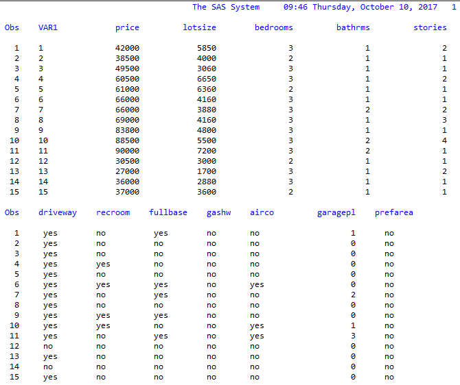
The data set has 546 observations (n = 546) and 13 variables. The variables in this dataset are:
Price (sale price of a house)

Lotsize (the lot size of a property in square feet)

Bedrooms (number of bedrooms)

Bathrms (number of full bathrooms)

Stories (number of stories excluding basement)

Driveway (does the house has a driveway ?)

Recroom (does the house has a recreational room ?)

Fullbase (does the house has a full finished basement ?)

Gashw (does the house uses gas for hot water heating ?)

Airco (does the house has central air conditioning ?)

Garagepl (number of garage places)

Prefarea (is the house located in the preferred neighbourhood of the city ?)

  1. Data View

sas data view.png

The first 15 observations are displayed above.

Chapter 2 A Simple Regression Model

  
  Predicting house price using its lot size. x=lot size, y=price.
SAS output
  1. Scatterplots

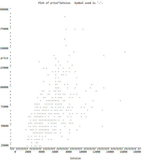
sas scatterplots.png

Scatterplot of price vs. lot size.

  1. Analysis of Scatterplot
  2. The Linear Regression Model
    State your regression model and briefly explain

The regression model is:
(a) the meaning of your YX term in the model;
(b) how the terms on the right-side are related to E(YX);
(c) how the terms on the right-side are related to V(YX).

  1. SAS Output for the Fitted Model

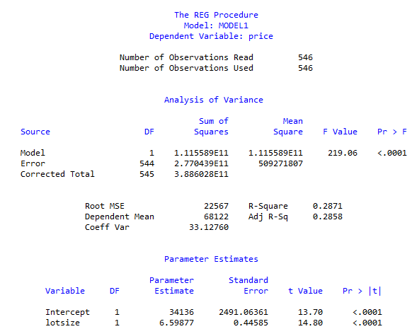
the proc reg SAS model.png
Run Proc Reg in SAS to fit your model. Show the table output, cleaned-up, and the SAS regression plot with the confidence and prediction bands. Otherwise, only show what you are going to use.

  1. Analysis of Output
    (a) The t-tests
    (i) What is being tested?
    (ii) What are the results of the test?
    (iii) Use the Story of Many Possible Sample to explain how the test is done.

(b) The -equation

    (i) State the equation for your fitted model;
 (ii) Explain howis related to E(YX) using the story of many possible samples.

(c) In the regression plot, explain what is being shown by the 95% confidence band and the 95% prediction band. Include a vertical x-cut to provide a focus for your explanation.