Posts tagged with spss assignment help

The goal of this lab is to start getting you comfortable using the Rguroo point-and-click interface and using the software to help visualize and interpret data.

Part I. Eye Color Dataset

For this part of the lab, we will explore the graphical features of Rguroo using the dataset called HairEyeColor. This dataset can be found on Titanium. Download the dataset to your desktop. In Rguroo in the left hand column select the dropdown Data, then select Data Import. Within Data Import select Data Frame, then select the file and select Upload.

Question #1 Once you have imported the data, then if you double click on the dataset name the raw data will show up. If you right click on the dataset name there are many features, one of which is the summary function. Using these features answer the following questions.
(a) How many variables are there in this dataset?
(b) Are the variables quantitative or categorical?
(c) Specifically name one of the variables, and state what values it can take.
(d) How many cases are in this dataset?

Question #2 Now let’s look at only the variable of Eye color and obtain a barplot of the values. Do this by clicking on the drop menu for Create Plot and select Barplot. We first need to select the dataset by clicking the drop down menu of Select a Dataset; choose HairEyeColor. Switch from Numerical/Freq tab to Categorical tab. Select the Factor 1 drop down menu and click on Eye. Now, click on the Relative Frequency selection. Fill in the Labels for the Title, X-Axis, and Y-Axis. Click on the eye icon to view the bar graph.
Copy the Barplot and paste it below.

Question #3 You can add the specific percentage of each category as well as other features by clicking on the Details tab. To add the specific percentages, go to Bar, Value Labels, Error Bars and select Add Value Labels. Press the eye icon to see the change.
Copy the new more detailed Barplot and paste it below.

Question #4 Based on your Barplot in the previous question, which category has the most people? Which has the least?

Question #5 We can also look at the Eye as a Factor of Gender. This would allow us to visually compare the distribution of Eye Color of males and females. To do this click on the Basics tab, and select Sex for the Factor 2 box and select the eye icon.
Copy the Barplot with eye color and gender and paste it below.

Question #6 Which color is most prevalent for females; which color for males?
Entering TWO-WAY Data in SPSS

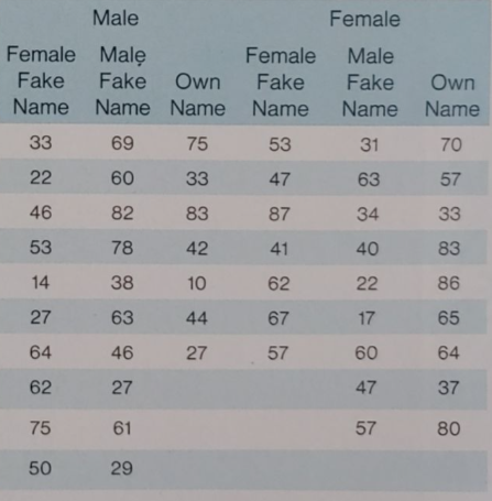
Statistics and maths anxiety are common and affect people's performance on maths and stats assignments; women, in particular, can lack confidence in mathematics (Field, 2010). Zhang, Schmader, & Hall, (2013) did an intriguing study, in which students completed a maths test in which some put their own name on the test booklet, whereas others were given a booklet that already had either a male or female name on it. Participants in the latter two conditions were told that they would use this other person's name for the purpose of the test. Women who completed the test using a different name performed better than those who completed the test using own name. (There were no such effects for men). The data below are a random subsample of Zhang et al.'s data. Enter them into SPSS and save the files as Zhang (2013) subsample.sav
2023-03-28T11:22:35.png

If you need help entering data in SPSS , then our statistic experts will be ready to facilitate you with that.

Use SPSS to produce a scatterplot of maths scores
Multilevel modelling assignment question
This coursework accounts for 10% of the total mark for the portfolio. In addition to the combined marks for each of the portfolio tasks, you will also be graded on the structure, presentation and clarity of the portfolio as a whole. So your work should be professionally presented, with good use of English.
In the real world, you will be expected to communicate the results from a statistical analysis you perform to non-statisticians, so you should conclude each task with a brief explanation of your results, presented in terms a layperson would understand.

Assignment description
This task is in the form of a tutorial based on Heck, Thomas and Tabata (2010). It will take you, step-by-step, through the process of building a multilevel model to explore the effect of socioeconomic status and school attended on the maths scores for a sample of American school students.
The data are presented in the file Mathscores.sav. This task must be performed using SPSS.
The file contains data for 6871 students attending 419 schools.
schcode
School identification code, numbered 1 to 419
Rid
Identification of each student within each school (non=unique)
id
Unique identifier for each student
ses
Standardised score on socio-economic index. This means that the scores have been standardised to a mean of zero and s.d. of 1. Therefore zero represents the brand mean socio-economic status across all students represented, and a unit difference represents a difference of 1 standard deviation.
math
The overall percentage scores of each student in a standard maths test. The next three variables are indicators of difference between the schools, and so may be used to explain any random effects we observe.
ses_mean
The mean of the standardised socio-economic scores within the sample from each school
per4yrc
The percentage of students planning to take a four-year university course after leaving within each school
public
Whether the school is public (1) or private (0). Note that this is the American meaning of public school, so equivalent to a British state school.

Use SPSS to produce a scatterplot of maths scores against socio-economic status using only the first 80 observations. Modify plot to add a regression line.

Hint: use Data Select Cases Based on time or case range What does this suggest about the nature of the relationship between these two variables? [2 marks]

Remove the cases selection and perform a simple regression analysis to show the effect of the socio-economic status on maths scores for all of the students in the sample.

What do the results indicate? How strong is this model?
Based on the standard regression assumptions, explain why the simple regression model may not be valid. [3 marks]
Reproduce the scatterplot (using the subset of 80 students), but this time, set markers by schcode, and add best fit lines for each school represented.

Hint: use the Add Fit Line at Subgroups option.
Use this plot to explain why multilevel modelling may be a better way of analysing this data. [3 marks]
8 marks total for Part 1
Remember to remove the case selection before moving on to the next part.

Null model random intercepts, no predictors

In this part we will build a model to show how allowing random intercepts for the different schools allows us to build a more appropriate model.

Select Analyze  Mixed Models  Linear.
Add schcode to the Subjects window. Continue. Select math as your dependent variable but don’t add any predictors.
Click the Random… button. Check that Variance Components is selected (otherwise we will also have random slopes), and an intercept is included. Add schcode to the Combinations box. Continue.

Click the Estimation button and select Maximum Likelihood. This is necessary for comparing nested models – we cannot do this if we use the default restricted ML. Continue.
Click the Statistics button and select Parameter estimates, Tests for covariance parameters, and Covariances of random effects. Continue.

Click OK.
Note the deviance and number of parameters. [1 mark]
What effect has this had on the estimate of the fixed (overall) intercept in comparison with the regression model? [1 mark]

The Estimates of Covariance Parameters table details tests for within group effects (called Residual) and the between groups effect (Intercept).

Given the null hypotheses of “no effect”, interpret these results in the context of the
data. [2 marks]